Implemented Marketing Content in the investment and trading App
Upstox is a mobile application for investing and trading. It was created for the Indian market giant of the same name. The app runs on iOS and Android.2,5 months
work of projectTask
The objective was to increase user engagement with the investment app.
The client wanted to add marketing content to simplify the investment process and keep users in the app, where they could follow company news and the stock market situation in general.
Solution
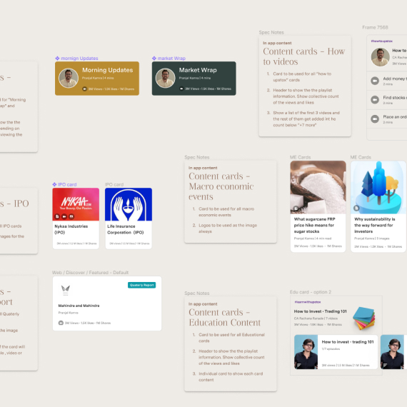
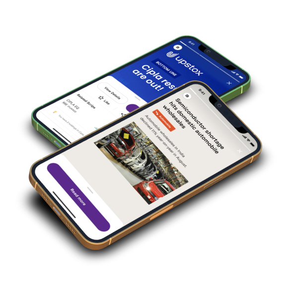
We implemented educational and news content in the stories format. This format allows users to switch between materials quickly and easily.
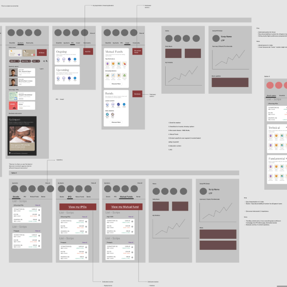
We created special information sections with constantly updated data: ratings, statistics, quotes and other information.
Development Process
The security and confidentiality of the development process is important to customers, so we were given personal access to the client’s infrastructure to work on the project. The project was restricted and intended for the Indian market only — an Indian phone number would be needed to sign into the app.
We discussed the objectives with the client, formalized the terms of reference and began development.
We worked closely with the client’s team. There were daily calls to discuss all the issues together with other Upstox development teams. We communicated via a public channel in Slack.
Upstox had their own UI/UX design team, while our objective was to integrate content into the mobile apps.
Development was done in Kotlin and Swift for Android and iOS respectively. Each version had its own development specifics that we had to take into account.
For the iOS version of the app, we had to build screen layouts using code instead of the visual Interface Builder. We used the client’s shared UI library for the whole project. Occasionally, we added custom components when the standard ones were not suitable for the chosen design. At first, building layouts using code seemed like a waste of time. But during the process, we developed a real appreciation for this method. Adding new features was slower, since we had to embed code in every screen. However, it allowed multiple teams to work on their respective tasks without worrying about interfering with other parts of the project.
The client decided that both versions of the app would follow the Clean Architecture principle combined with the MVVM pattern. This is a “layered” type of architecture that has an isolated core with business logic at its center, surrounded by interfaces and databases. The main principle of this logic is that all dependencies flow strictly from the outer to the inner circles. This approach increases the amount of code but allows the self-contained kernel to be used in any other project with the same architecture.
We also worked with the backend team on an API to integrate the frontend with the backend, and with the frontend team on the web version of the app. This helped each team to do their work faster and better.
All teams participated in discussions about solutions. For example, someone would suggest a feature, we would describe its technical implications, and the design department would evaluate its consistency with the overall project concept. Then the backend team would give their opinion on what kind of content would be easier to manage.
The Hardest Part
Building the stories layout for the app. The client’s primary reference point was Instagram Stories. These combine a lot of different elements: reactions to gestures, auto-transitions between screens, progress bars and so on. But the client decided to incorporate videos from YouTube rather than from their own servers.
In terms of content management, this is much more convenient: you don’t need your own servers or a complex loading interface — YouTube does it all for you. That said, videos from YouTube can only be played in the YouTube player, and the YouTube player has its limitations. You have to have the YouTube player constantly running in the foreground to prevent the video from pausing. That means there is no way to interact with the interface and watch the video at the same time.
How we solved these tasks
We made the video playback area a little smaller and reserved a separate space for navigation and information elements. This allowed us to use the controls even when they were not in the foreground.

Svetlana Chernyavskaya
“This project was well-documented, with specifications on architecture, code style and existing APIs. We appreciated having such a high standard of documentation. It helped us a lot with many things, and was convenient to work with. There was a lot of code, but it was unified, easy to read, and easy to maintain due to its consistency with the original architecture.
Documenting takes time, of course, which is why people tend to put it off or abandon it altogether. But in large projects, it is so important to keep the documentation in order. It makes it so much faster for a new team to get into the project and speeds up code review. The Upstox case was yet another demonstration of that.”


Technology Stack
Backend
Mobile app
Results
We implemented marketing content in the app in the form of education and news stories, including videos. We also created dynamic information sections in the app where users can monitor stock exchange ratings and quotes that are updated in real time.
We completed all our tasks and delivered the project to the client.
The marketing content is displayed in the stories format with manual control (swipes, taps and other actions). Videos from YouTube are played in the stories.